
DNTM 6-7 REVIEW

MEHHH week overall tbh except for my #1. A bit of a let down.
#dntm7 dimitra
10th- camell22
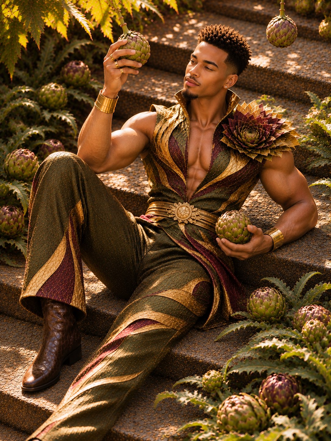 Boring. No high fashion or editorial potential. Weak pose, weak facial expression, no concept. Worst photo by far tbh. Sorry if that’s mean it’s no shade to you I just don’t think you understand high fashion or editorial photos.
9th- lluckygc
 This concept has so much potential. I wish you went full fantasy world and made the plate huuuuuge with a more zoomed-out camera angle so you looked a bit smaller and more food-sized. Playing with camera angles and proportions could have made this more editorial looking. I like the posing, but overall it feels a bit cliche instead of high fashion.
8th- robbieriot
 Okay photo but meh. Not creative or exciting to me. You’re really boring this season tbh. I remember you having a lot more creativity than this.
7th- honey
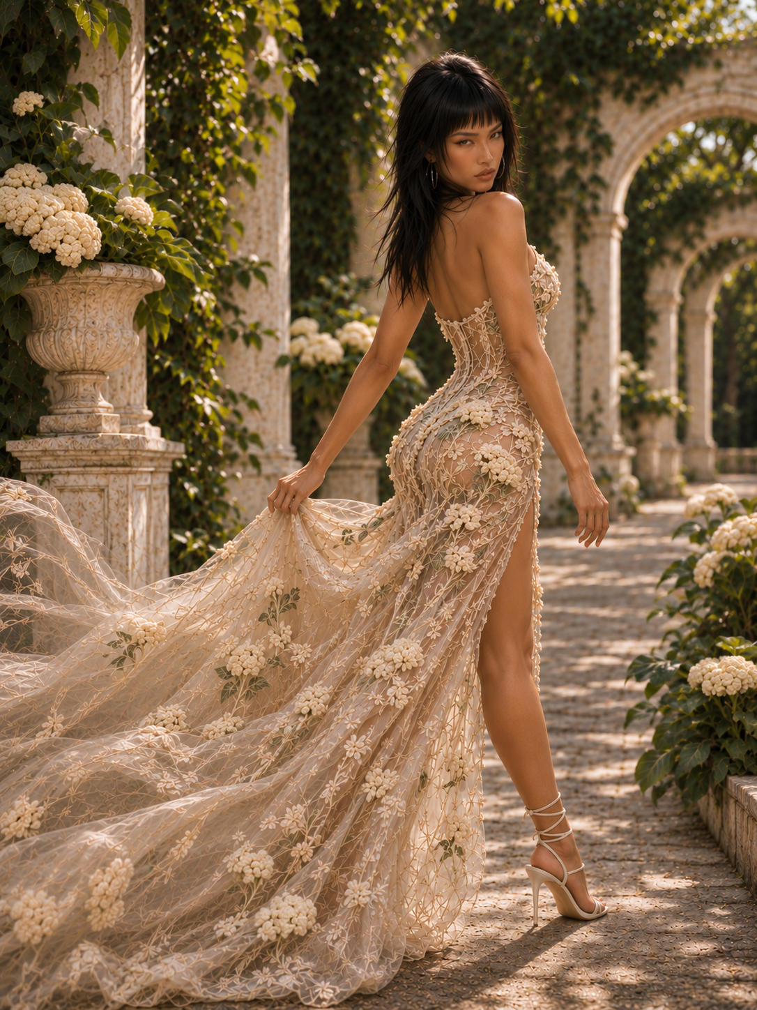 Nothing wrong with this. It’s cute but safe. There’s no striking concept here. Lack of editorial presence.
6th- lyanka
 Very well could see this in a magazine. I completely get what you were going for but this reads more as an Ad instead of high fashion editorial to me.
5th- tezu
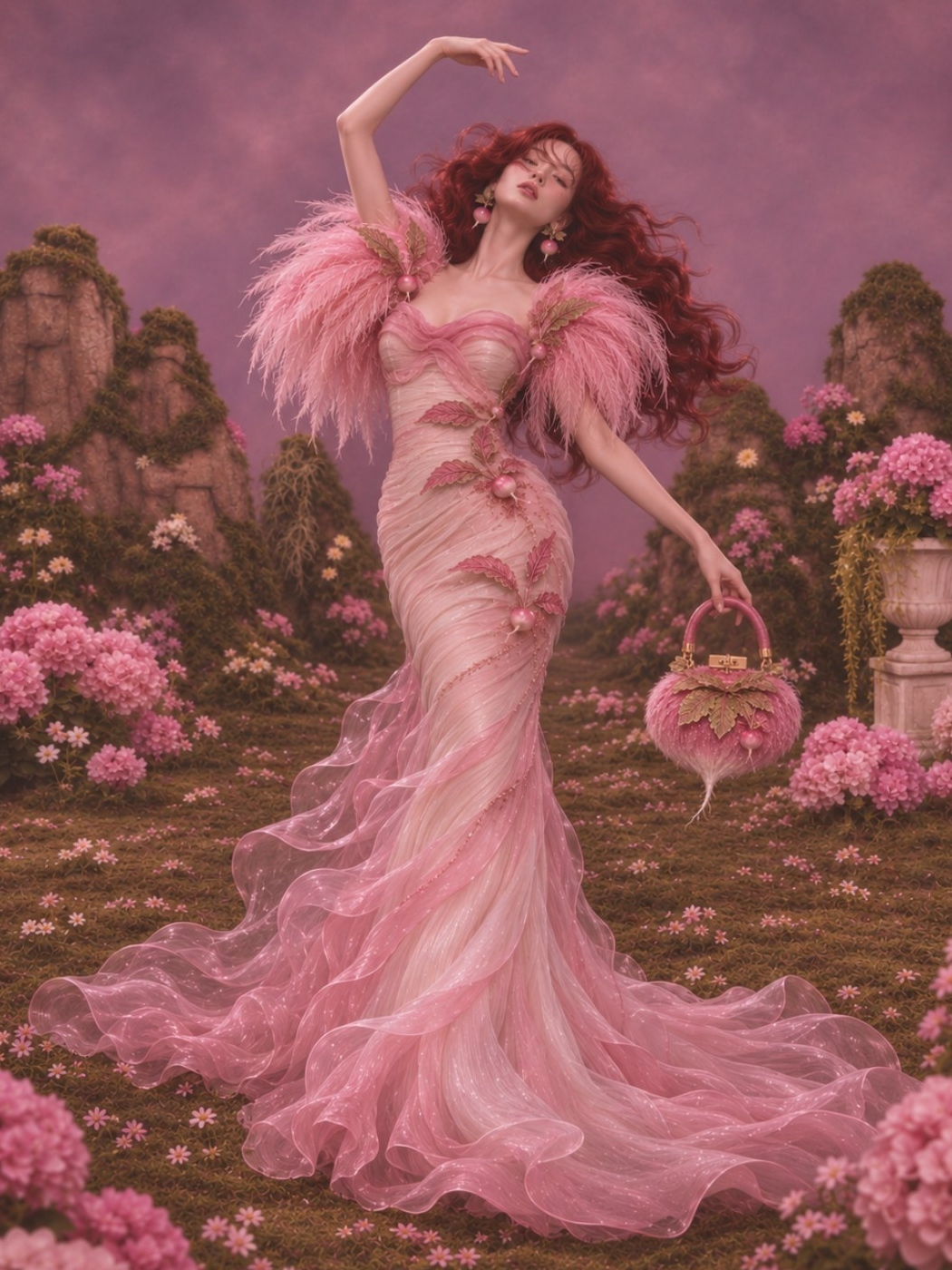 Creative concept and beautiful photo. But, I feel like your posing feels a bit stiff. I also just favor more realistic photos.
(PENALTY) 4th/idk - zee_
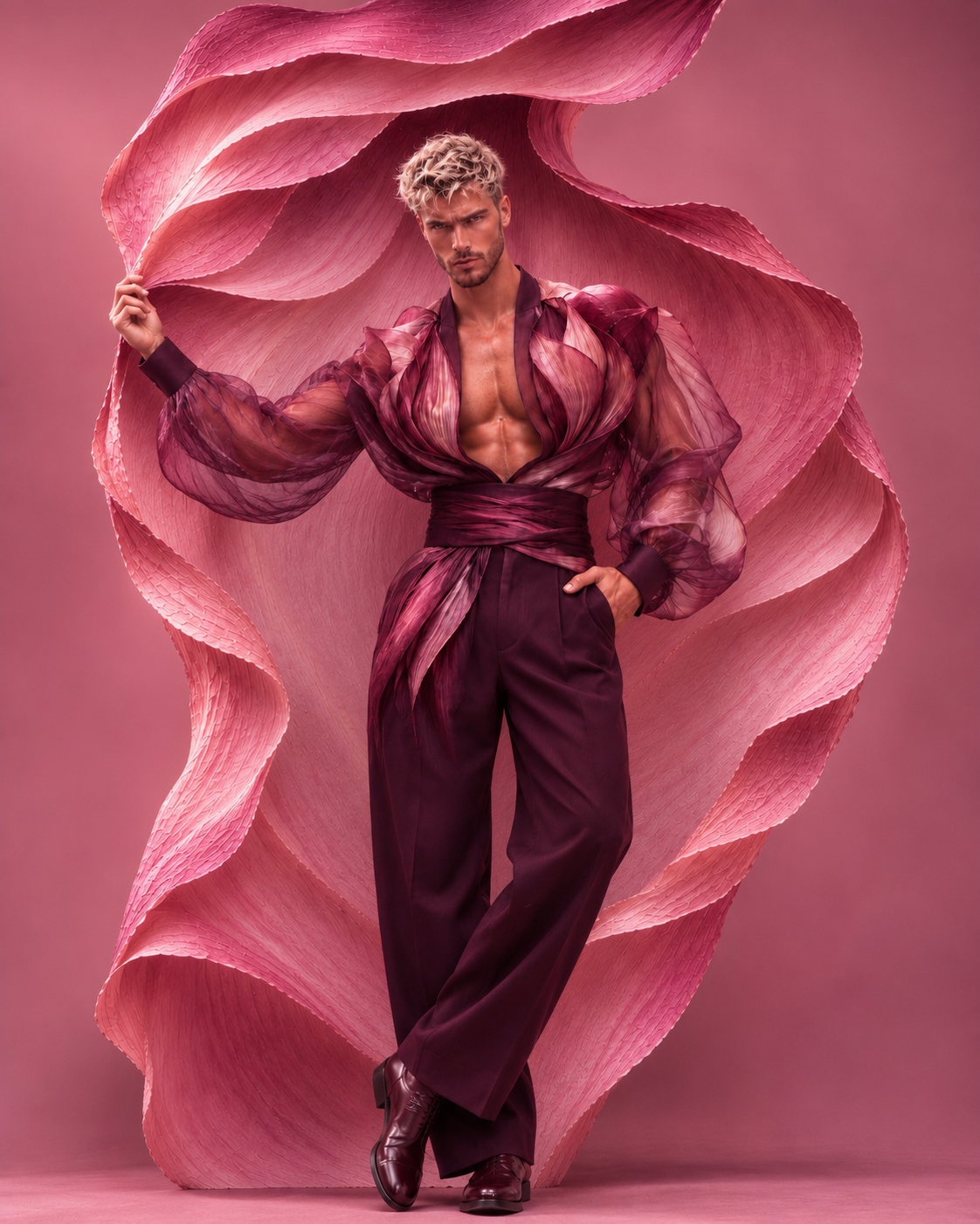 I quite like this photo. It’s cute and simple but still looks creative. My main issue is I have no clue what vegetable this is supposed to be. Maybe I’m dumb but I wish it was more obvious. Like is it pink cabbage?
3rd- torree
 I HATE your outfit. The silhouette of it is great and so fashion and fun but I really really hate the cactus print of it. It looks too AI and blends in with the background too much. This photo would’ve really popped had you chosen a different material for the outfit and done for a bit more realistic silhouette. Posing is great and overall image does feel high fashion so that’s why you get 3rd.
2nd- tommyxx
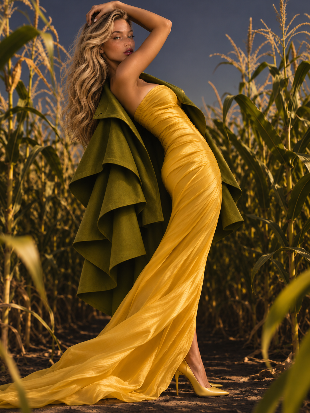 I enjoy the realism of this. Posing is great. I wish you had chosen a different style of jacket. The ruffles pull too much focus.
HUUUUUUUUUGE GAP
1st- pat
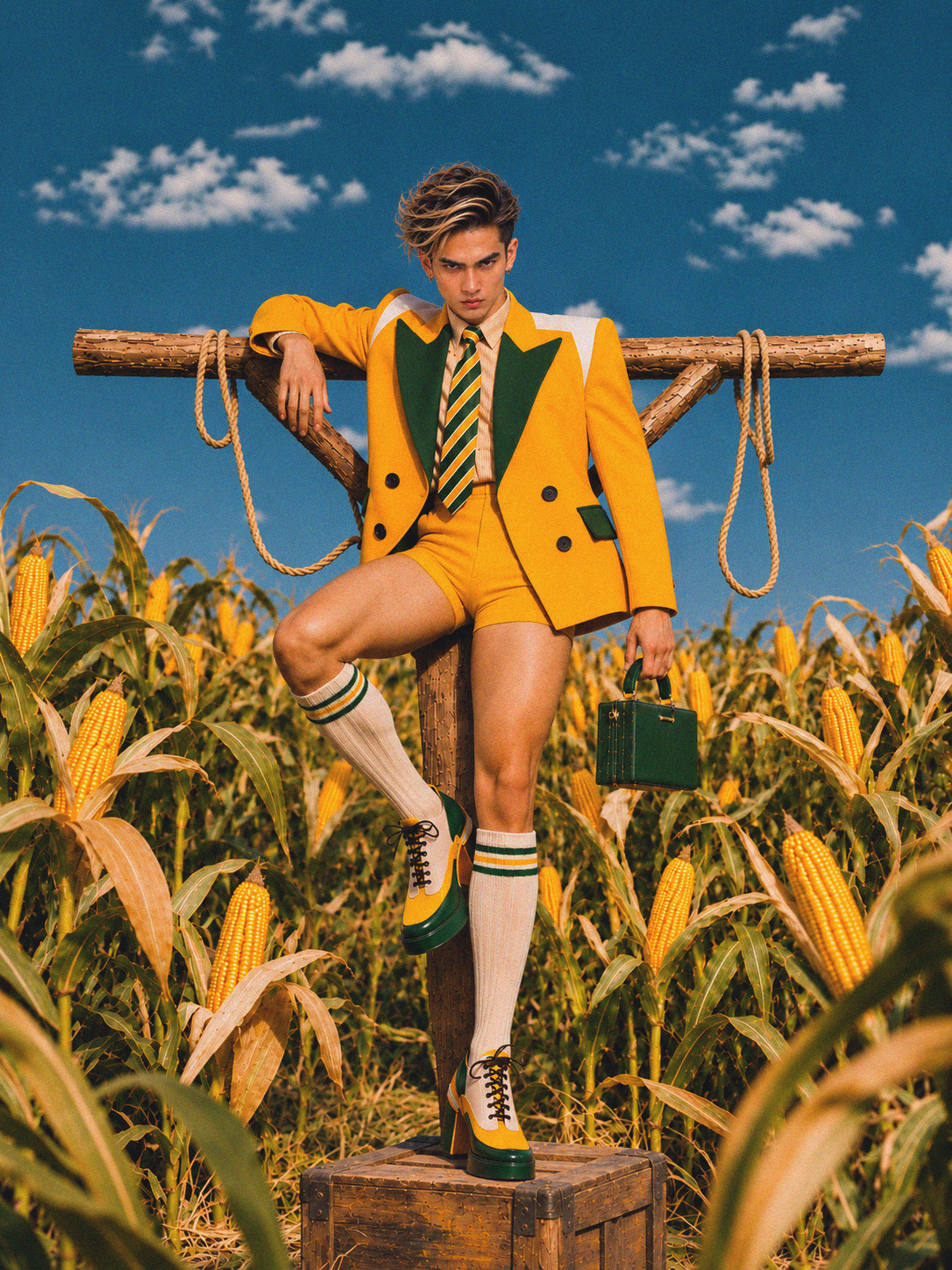 This is everything. Conceptual, high fashion, creative. Good posing. Great outfit. Facial expression isn’t my favorite but you ate this uppppp. You really destroyed the girls this week.
Boring. No high fashion or editorial potential. Weak pose, weak facial expression, no concept. Worst photo by far tbh. Sorry if that’s mean it’s no shade to you I just don’t think you understand high fashion or editorial photos.
9th- lluckygc
This concept has so much potential. I wish you went full fantasy world and made the plate huuuuuge with a more zoomed-out camera angle so you looked a bit smaller and more food-sized. Playing with camera angles and proportions could have made this more editorial looking. I like the posing, but overall it feels a bit cliche instead of high fashion.
8th- robbieriot
Okay photo but meh. Not creative or exciting to me. You’re really boring this season tbh. I remember you having a lot more creativity than this.
7th- honey
Nothing wrong with this. It’s cute but safe. There’s no striking concept here. Lack of editorial presence.
6th- lyanka
Very well could see this in a magazine. I completely get what you were going for but this reads more as an Ad instead of high fashion editorial to me.
5th- tezu
Creative concept and beautiful photo. But, I feel like your posing feels a bit stiff. I also just favor more realistic photos.
(PENALTY) 4th/idk - zee_
I quite like this photo. It’s cute and simple but still looks creative. My main issue is I have no clue what vegetable this is supposed to be. Maybe I’m dumb but I wish it was more obvious. Like is it pink cabbage?
3rd- torree
I HATE your outfit. The silhouette of it is great and so fashion and fun but I really really hate the cactus print of it. It looks too AI and blends in with the background too much. This photo would’ve really popped had you chosen a different material for the outfit and done for a bit more realistic silhouette. Posing is great and overall image does feel high fashion so that’s why you get 3rd.
2nd- tommyxx
I enjoy the realism of this. Posing is great. I wish you had chosen a different style of jacket. The ruffles pull too much focus.
HUUUUUUUUUGE GAP
1st- pat
This is everything. Conceptual, high fashion, creative. Good posing. Great outfit. Facial expression isn’t my favorite but you ate this uppppp. You really destroyed the girls this week.
4 votes, 54 points
Comments
📸📸📸
Omggg yey you love it!! I feel honored. Thank you sm!! I do agree, after looking at it for a while I feel like my expression is too intense and could’ve been softer on my setting haha.
Pat also eyyy the corn duos are her top 2 haha
Thank you for the feedback love 🤍 Kinda confused how the silhouete isnt realistic tho 😭 Its just a Basic dress with some hips. I tried to go for camp avant-garde editorial 🤍
Torree camp avant-garde editorial is three different categories all in one 😭. The spikes, the hips, the cactus print all together felt a bit unrealistic to me. I enjoyed the silhouette but you can’t tell me that’s realistic. Same with Tezu. Just my opinion, but I think changing the material of the dress would’ve helped a lot and all I said was that I wished the silhouette was a “bit more realistic”. I think you are one of the most interesting people left in the competition though so keep it up!
Jane Thank baby! Dont think I am mad or anything! I always appreciate critics! Dont think I am always the best type of girl. I think you were pretty spot on with the ranks this week 🤍