My ranking for DNTM photoshoot #4
i think people forget
just watched
to the 4 shop owners
rate my avi :3
View All Blogs
My ranking for DNTM photoshoot #4

I knew the other girlies were gonna go sultry and sophisticated, so I went with an unexpected route with a more y2k and fresh concept for the bachelorette theme. rankings:
13th - gatopisado
 There were a lot of photos taken in a grand mansion, but this one was the weakest for me. The shoot looks a little cheap, and your model looks kind of old. The dress is bunched around your stomach area and we lose part of your figure. Overall very standard and expected.
12th - Cristi
There were a lot of photos taken in a grand mansion, but this one was the weakest for me. The shoot looks a little cheap, and your model looks kind of old. The dress is bunched around your stomach area and we lose part of your figure. Overall very standard and expected.
12th - Cristi
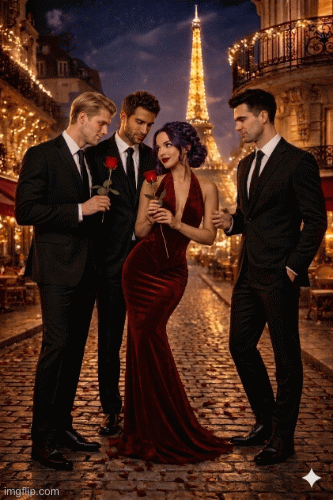 I find the photo really cute, but reminds me a lot of netflix/romcom posters. I wish you hadnt used Paris as a backdrop, because it looks quite odd. I know you were struggling with your hair colour, but I enjoyed your model here. Lovely dress.
11th - Antog
I find the photo really cute, but reminds me a lot of netflix/romcom posters. I wish you hadnt used Paris as a backdrop, because it looks quite odd. I know you were struggling with your hair colour, but I enjoyed your model here. Lovely dress.
11th - Antog
 This looks like a The Bachelorette promotional ad, which isnt a bad thing at all, but its also nothing special. I like the picture, but there are minor tweaks I wouldve done to make it stand out more.
10th - lluckygc
This looks like a The Bachelorette promotional ad, which isnt a bad thing at all, but its also nothing special. I like the picture, but there are minor tweaks I wouldve done to make it stand out more.
10th - lluckygc
 Again, lovely photo, but theres no wow factor. It's very standard and I wished you wouldve thought outside the box because the competition is really getting stiff.
9th - akaliuchis
Again, lovely photo, but theres no wow factor. It's very standard and I wished you wouldve thought outside the box because the competition is really getting stiff.
9th - akaliuchis
 Another photo I liked, but the same issue as the previous person; theres nothing that makes me do a double take. Your model looks sexy though !
8th - manyomash
Another photo I liked, but the same issue as the previous person; theres nothing that makes me do a double take. Your model looks sexy though !
8th - manyomash
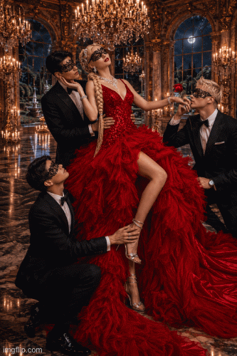 Probably my favorite dress out of the bunch. This is giving YA dystopian romance cover art and I live. You did really good, but I wouldve preferred the mask off, and would have maybe taken that chandelier out above your head.
7th - BRAT
Probably my favorite dress out of the bunch. This is giving YA dystopian romance cover art and I live. You did really good, but I wouldve preferred the mask off, and would have maybe taken that chandelier out above your head.
7th - BRAT
 Your photos are always clean, cute and polished ! I do think the other concepts this week were a little bit more interesting to me. I love the detail of the tie kinda acting like a red runway.
6th - misskant
Your photos are always clean, cute and polished ! I do think the other concepts this week were a little bit more interesting to me. I love the detail of the tie kinda acting like a red runway.
6th - misskant
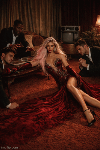
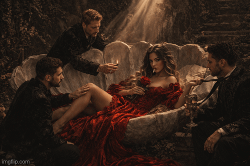 The birth of Venus ! I tried to recreate the same thing, but I flopped and had to scrap it lmaoo. Love the way your head words, love this photo. However, I wish the lighting was used better, maybe a stronger spotlight with the sun on you wouldve made a bigger difference
5th - Sprite
The birth of Venus ! I tried to recreate the same thing, but I flopped and had to scrap it lmaoo. Love the way your head words, love this photo. However, I wish the lighting was used better, maybe a stronger spotlight with the sun on you wouldve made a bigger difference
5th - Sprite
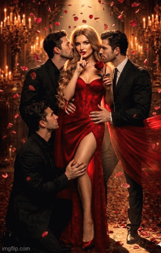
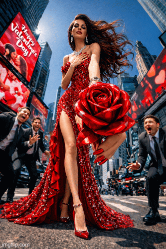
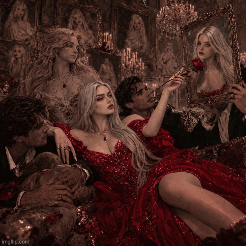 I think we all know by now how much you excel in the details. I love that you tried something a bit out of your style. The rose offer to your own portrait is gaggy and I live. However, some of the environment around you does get a bit overwhelming.
4th - Maris
I think we all know by now how much you excel in the details. I love that you tried something a bit out of your style. The rose offer to your own portrait is gaggy and I live. However, some of the environment around you does get a bit overwhelming.
4th - Maris
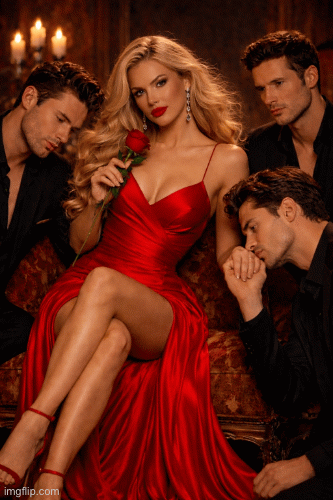
 Gorgeous ! your model looks so gooood. I know this photo is a bit lacking in creativity, but its a perfectly constructed photo. The best one out of all the more standard concepts for this photoshoot for sure.
3rd - jane
Gorgeous ! your model looks so gooood. I know this photo is a bit lacking in creativity, but its a perfectly constructed photo. The best one out of all the more standard concepts for this photoshoot for sure.
3rd - jane
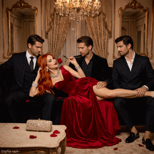
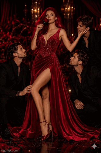
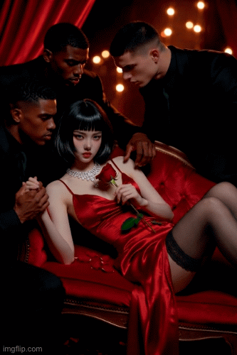
 Definitely the riskiest and edgiest photoshoot of the bunch. And personally, it worked for me. Its alluring with a quiet dominance. Good job !
2nd - kaliminaj
Definitely the riskiest and edgiest photoshoot of the bunch. And personally, it worked for me. Its alluring with a quiet dominance. Good job !
2nd - kaliminaj
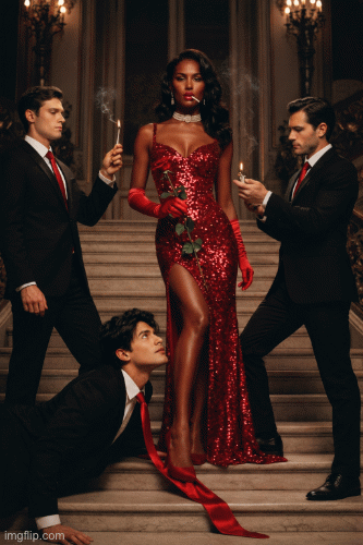
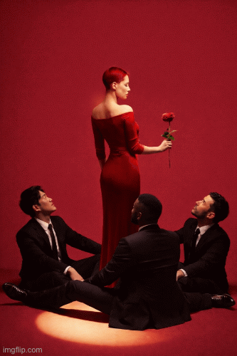
 you going 2/2? I liiiiiive. No notes, loved, but I do still prefer mine hehe
1st - Medusaluh
you going 2/2? I liiiiiive. No notes, loved, but I do still prefer mine hehe
1st - Medusaluh
 I loved mine. period.
There were a lot of photos taken in a grand mansion, but this one was the weakest for me. The shoot looks a little cheap, and your model looks kind of old. The dress is bunched around your stomach area and we lose part of your figure. Overall very standard and expected.
12th - Cristi
I find the photo really cute, but reminds me a lot of netflix/romcom posters. I wish you hadnt used Paris as a backdrop, because it looks quite odd. I know you were struggling with your hair colour, but I enjoyed your model here. Lovely dress.
11th - Antog
This looks like a The Bachelorette promotional ad, which isnt a bad thing at all, but its also nothing special. I like the picture, but there are minor tweaks I wouldve done to make it stand out more.
10th - lluckygc
Again, lovely photo, but theres no wow factor. It's very standard and I wished you wouldve thought outside the box because the competition is really getting stiff.
9th - akaliuchis
Another photo I liked, but the same issue as the previous person; theres nothing that makes me do a double take. Your model looks sexy though !
8th - manyomash
Probably my favorite dress out of the bunch. This is giving YA dystopian romance cover art and I live. You did really good, but I wouldve preferred the mask off, and would have maybe taken that chandelier out above your head.
7th - BRAT
Your photos are always clean, cute and polished ! I do think the other concepts this week were a little bit more interesting to me. I love the detail of the tie kinda acting like a red runway.
6th - misskant
The birth of Venus ! I tried to recreate the same thing, but I flopped and had to scrap it lmaoo. Love the way your head words, love this photo. However, I wish the lighting was used better, maybe a stronger spotlight with the sun on you wouldve made a bigger difference
5th - Sprite
I think we all know by now how much you excel in the details. I love that you tried something a bit out of your style. The rose offer to your own portrait is gaggy and I live. However, some of the environment around you does get a bit overwhelming.
4th - Maris
Gorgeous ! your model looks so gooood. I know this photo is a bit lacking in creativity, but its a perfectly constructed photo. The best one out of all the more standard concepts for this photoshoot for sure.
3rd - jane
Definitely the riskiest and edgiest photoshoot of the bunch. And personally, it worked for me. Its alluring with a quiet dominance. Good job !
2nd - kaliminaj
you going 2/2? I liiiiiive. No notes, loved, but I do still prefer mine hehe
1st - Medusaluh
I loved mine. period.
4 votes, 52 points
Comments
You slay queen 💖
@Medusuh i love yours as well. Thank you so much sis. We killed it!!!!
KaliMinaj Medusaluh
Ty love <3
🧡🧡